Design Takes on COVID
The Association of Registered Graphic Designers (RGD) recently hosted a webinar on the use of infographics in the pandemic, and asked: Are we getting a clear picture? RGD is the Ontario-based association of graphic design practitioners, educators and managers. Their mandate is to advance the value of design in business, create a community for design professionals to exchange experiences and knowledge, host virtual and in-person conferences, and to uphold professional design industry standards. It’s a great organization. Arlene Gould from the Toronto-based Design Industry Advisory Committee (DIAC) hosted the online chat.
Since the pandemic began we have been bombarded by data, with information changing daily, it’s hard to keep a clear picture of the state of the pandemic - data overload is not uncommon. Through the lens of design, information graphics can help us understand the crisis. Design can actually combat the pandemic.
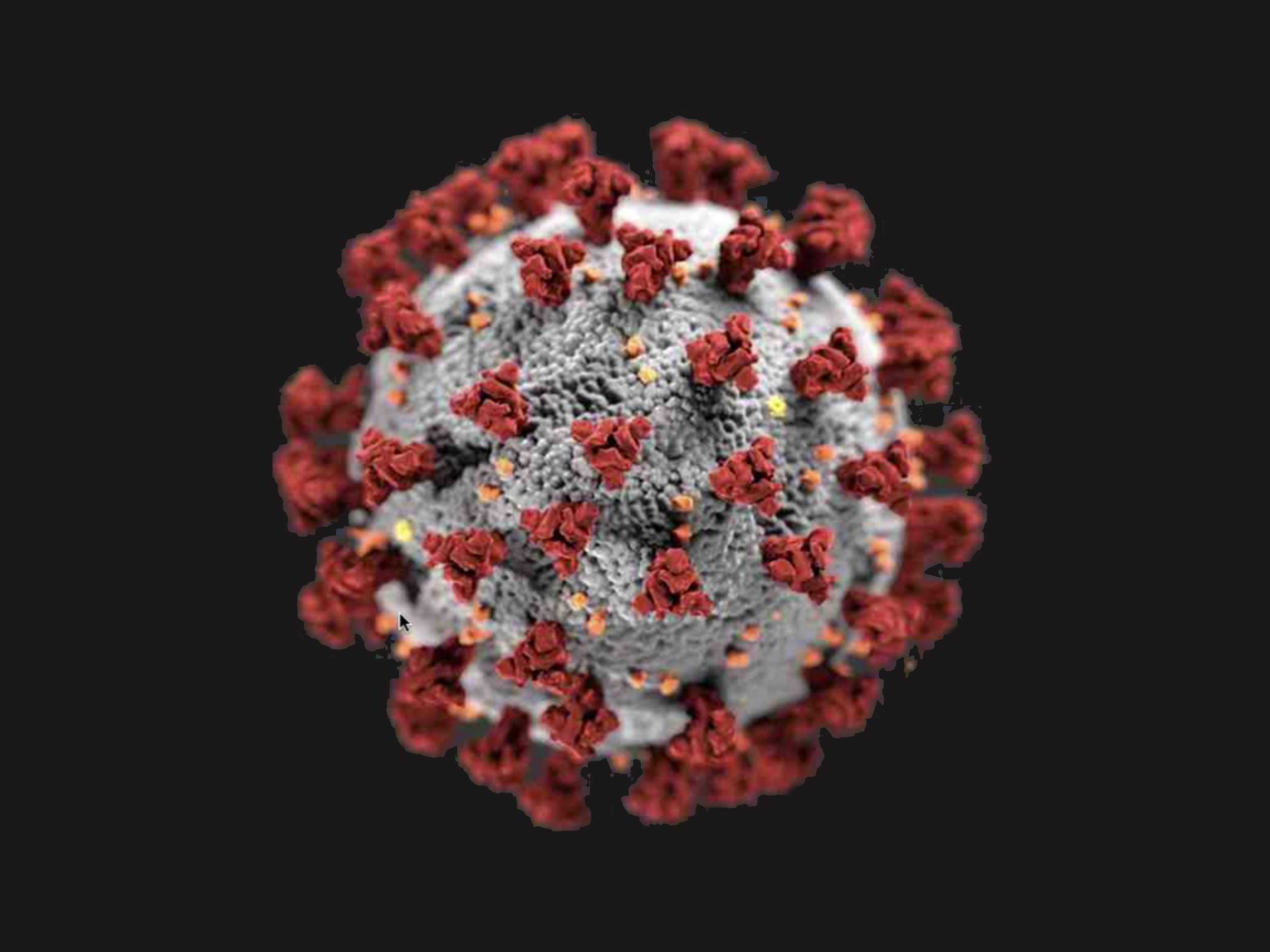
Take for example the familiar image of the actual coronavirus: that achromatic gray sphere with those red S-protein spikes forming the corona, or crown. It was illustrated by Alissa Eckert and Dan Higgins for the CDC, tasked with creating the “beauty shot” to bring it to public attention. While the shape of the virus is correct, the colour is a bit more complicated. Virus visualization is challenging because viruses exist in a sub-microscopic realm where colour has no meaning. While the coronavirus interacts with light, at short wavelength light - like UV and x-ray light - it doesn’t actually have any colour. It really is an invisible killer. Embracing grayness in fact has advantages: it fits the science where light can’t actually reach at sub-microscopic levels and it just appears less threatening, hostile invader though it is. Absent vivid colour, we can reduce our anxiety and perhaps direct our efforts to actually reduce transmission.
Panelist Dr. Milena Radzikowska suggested that we have seen the emergence of a coronavirus identity: it has even been humanized as a party-crashing unwanted guest, or an alien invader. War metaphors are commonly used in headlines to describe our current situation. It makes sense - the virus is the enemy, the strategy is to flatten the curve, front-line workers are the soldiers, and we hunker down with stay-at-home orders. We can understand the situation, we can relate to it.
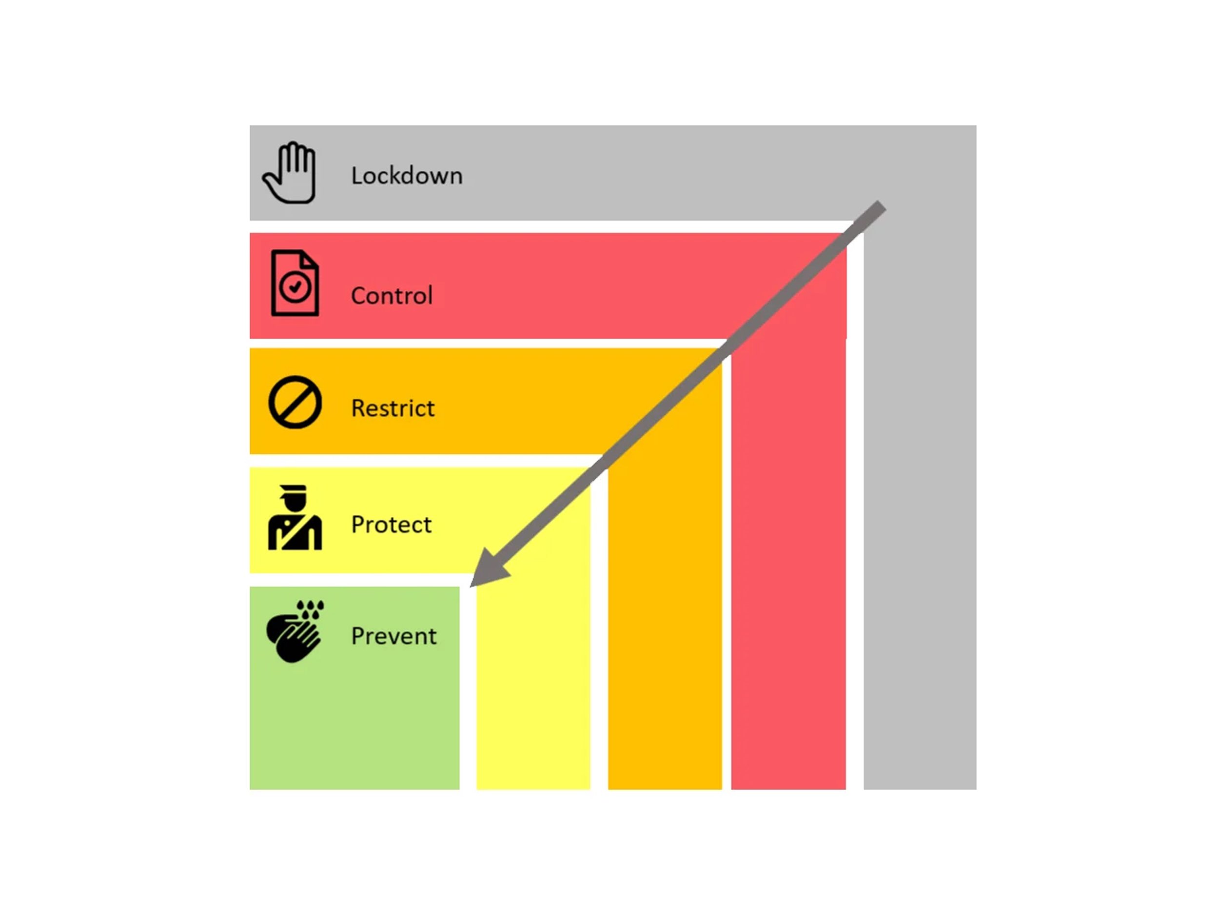
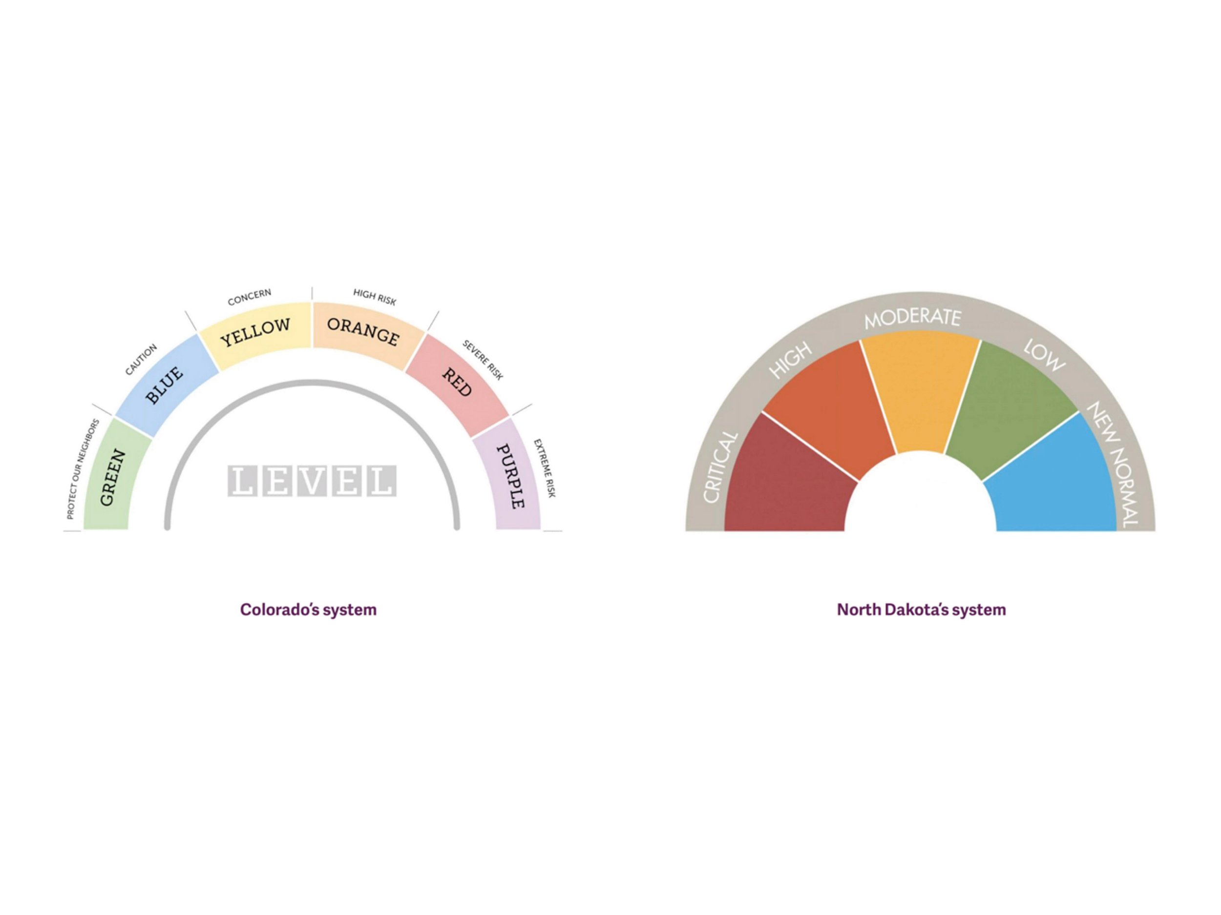
Panelist and designer Michelle Hopgood, RGD, spoke of the need for information literacy, developing the critical skills to locate, evaluate, and effectively use information. She commented on the patchwork solutions offered by public health agencies in Canada and the US to communicate risk levels. For example, an infographic from North Dakota features a colour dial/speedometer graphic hierarchy that features a ‘New Normal’ zone. It’s simply designed, but ‘New Normal’? That designation is bound to confuse. Ontario’s COVID response framework features a five-step colour-coded box ranging from green (Prevention) to gray (Lockdown). More gray again. She finds the framework lacks a sense of urgency, it employs a confusing colour palette, and generally lacks a sense of emotional attachment - it could be an infographic in any PowerPoint presentation, yet it is a critically important communications tool meant to provide guidance and clarity on the status of community health in the pandemic. As Matt Elliott observed in The Toronto Star recently, the colour-code system has effectively been tossed away. While standards make sense, he believes the provincial government has undermined its own system, changing the rules so frequently that guidelines no longer appear to be meaningful. Michelle Hopgood observed that now, more than ever, we need national guidelines on visualization of critically important information.
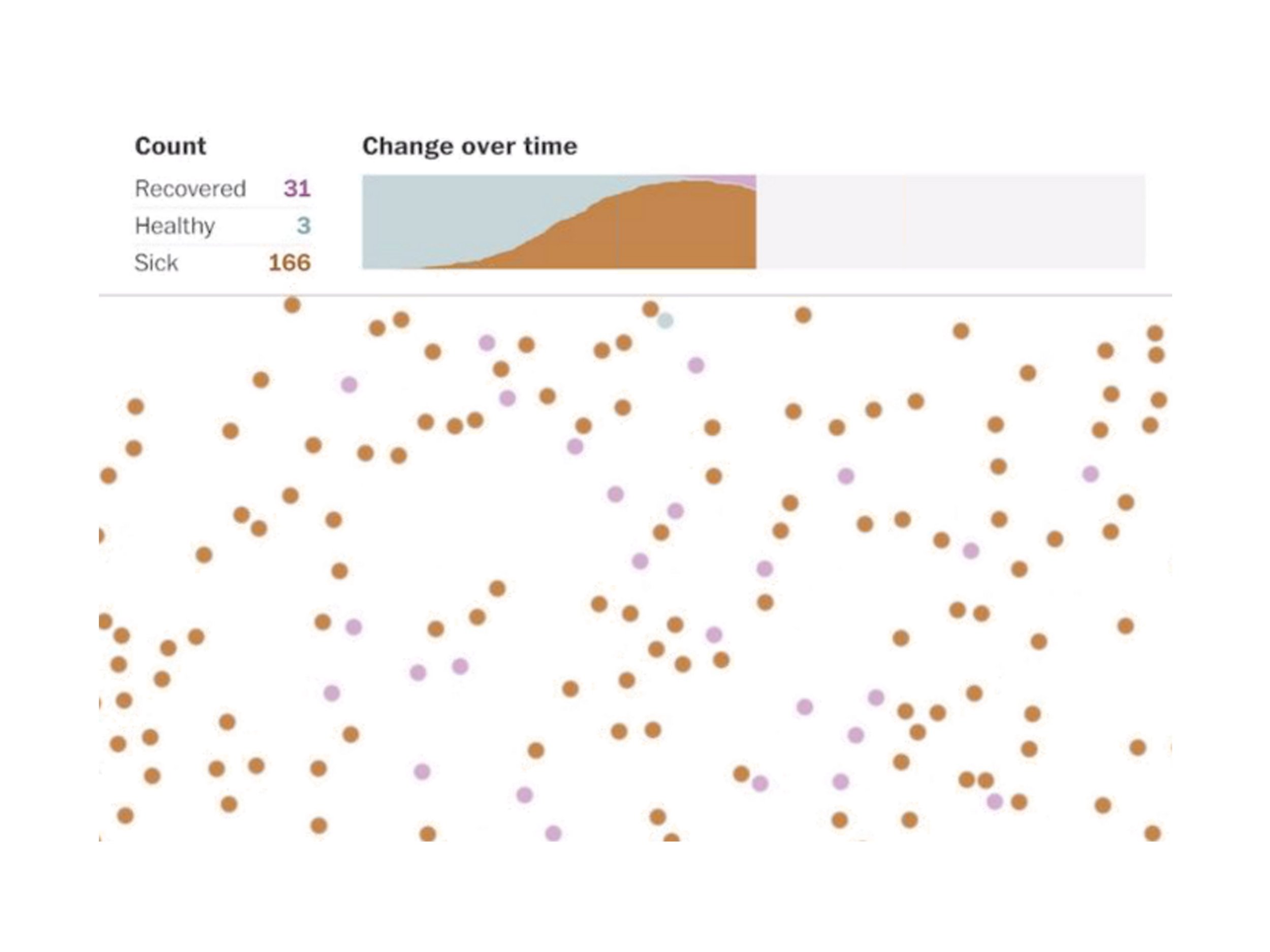
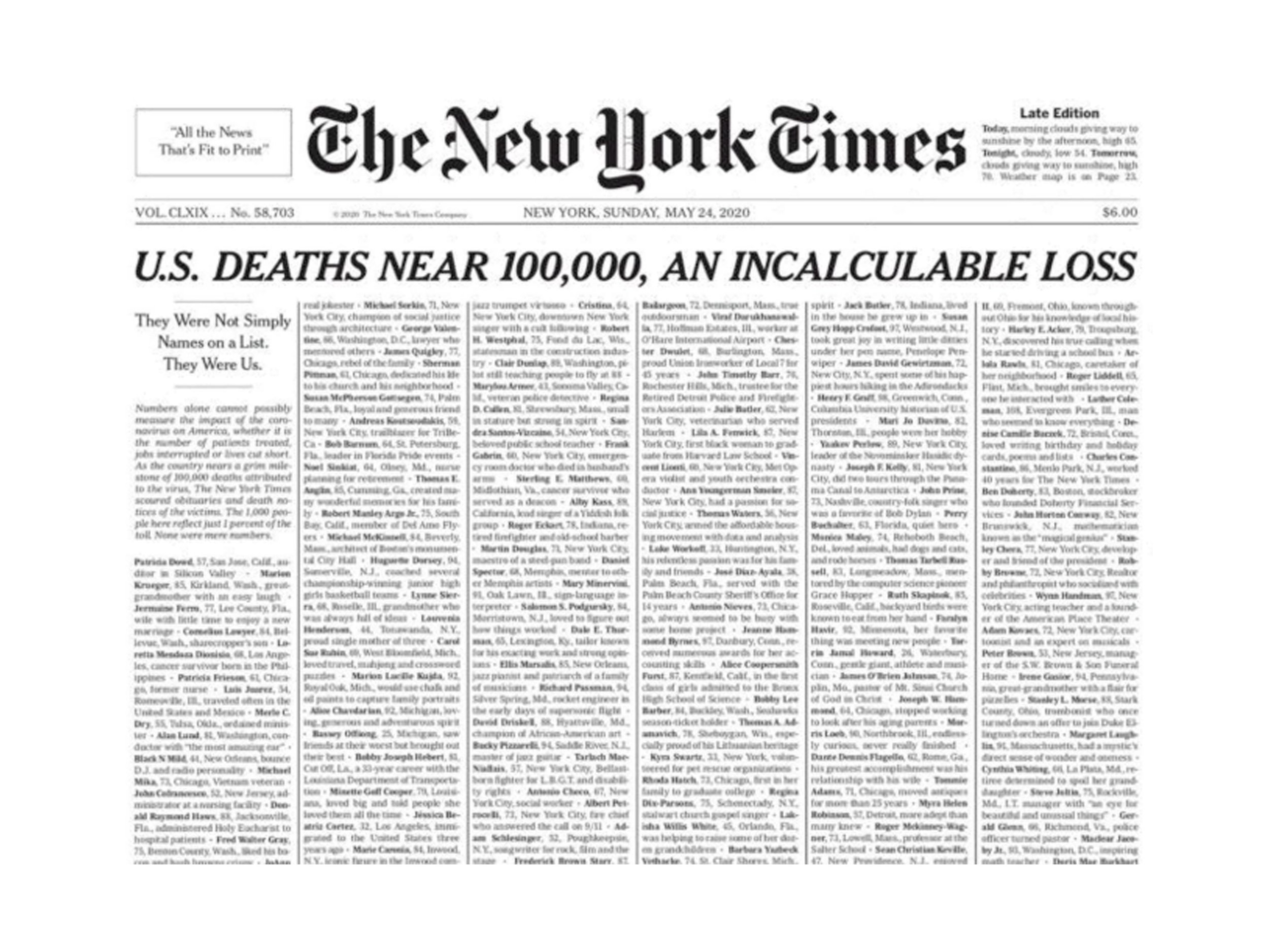
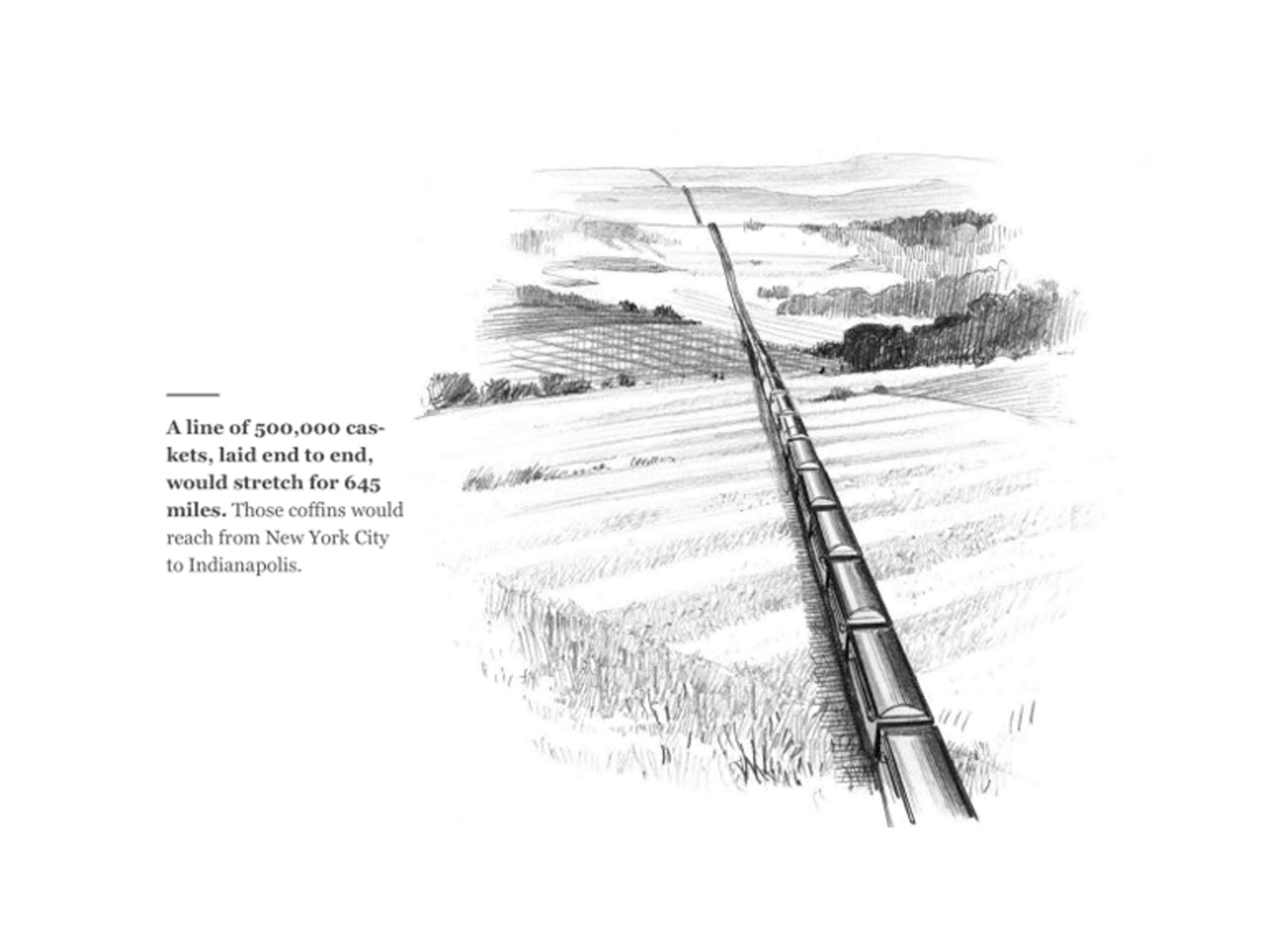
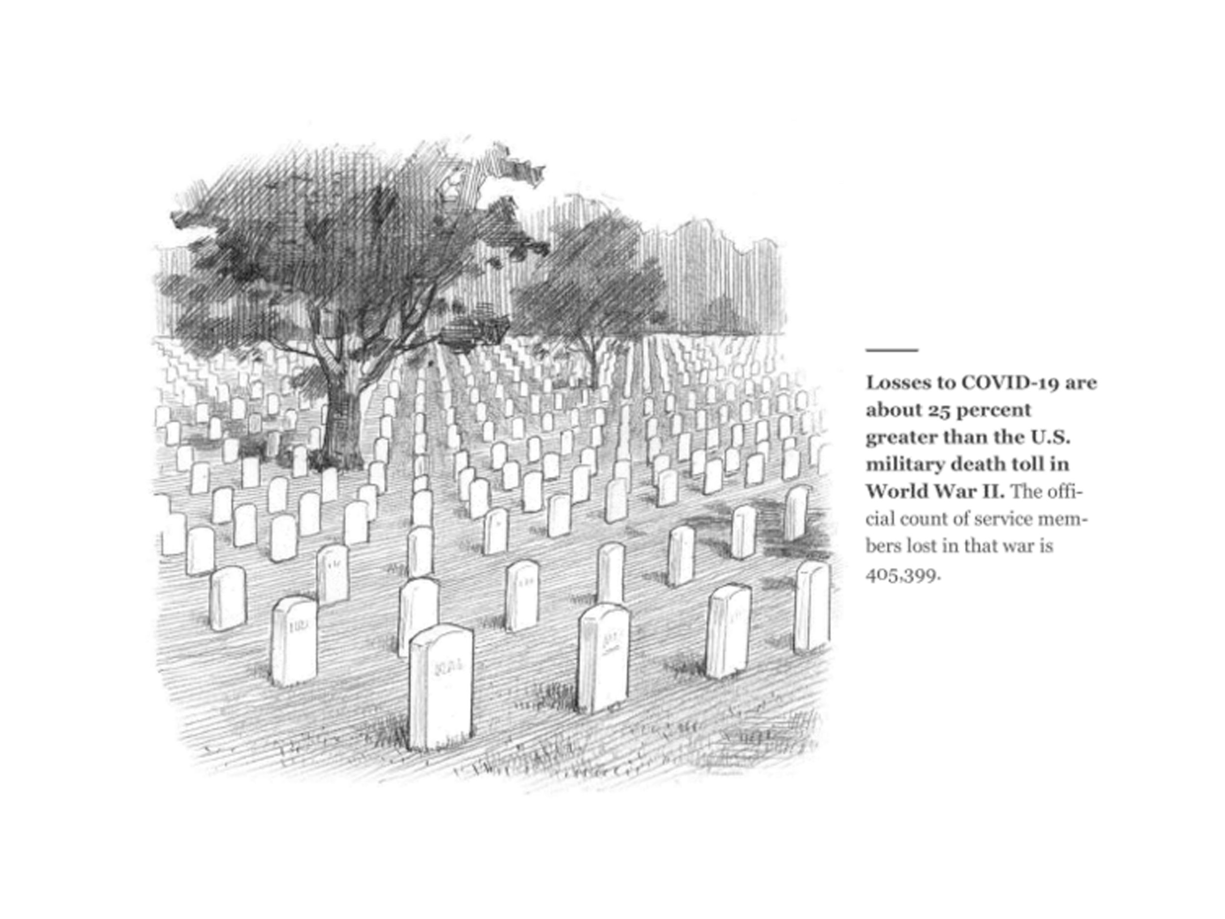
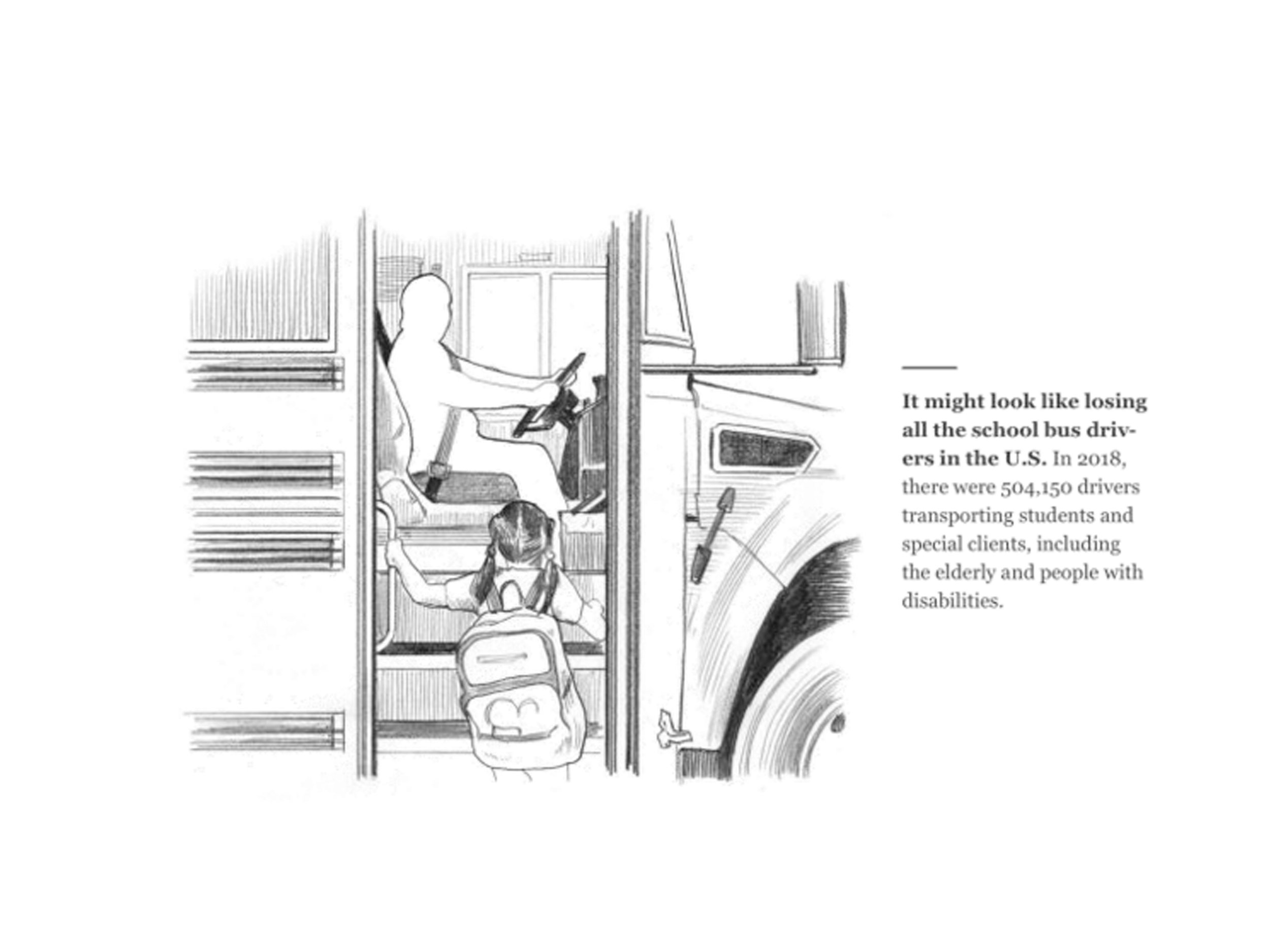
Motion designer, Julian Brown, RGD, offered striking examples that have attempted to overcome our COVID fatigue. The Washington Post produced a brilliant and effective infection simulator motion graphic that demonstrated the rising infection curve with shifting dots representing people in contact with each other; sick brown dots multiply as the curve rises while healthy blue dots diminish. It’s an effective demonstration of the power of interactivity and motion to convey a complicated data set. As the US approached 100,000 COVID deaths, the New York Times famously printed the names of lives lost on page one - six columns of tightly packed names, an incalculable loss. National Geographic depicted the crisis with simple, deeply meaningful, and beautifully rendered illustrations by Joe Mckendry: a line of caskets over 600 miles long, a vast military service cemetery, a school bus absent the driver. The series of illustrations effectively drafted a narrative, humanizing the data behind the science.
This was a really engaging and thoughtful webinar from RGD. The panelists all observed that while we may tend to forget, embedded in those graphs and data visualizations are the lives of people impacted by COVID: there is humanity in the numbers.

Sources:
phys.org/news/2020-03-scary-red-icky-green-coronavirus.html
www.forbes.com/sites/startswithabang/2020/04/15/no-the-covid-19-coronavirus-is-not-actually-red/?sh=51dd75595cbd
theconversation.com/war-metaphors-used-for-covid-19-are-compelling-but-also-dangerous-135406
www.nytimes.com/2021/04/02/style/coronavirus-safety-colors-states.html
www.washingtonpost.com/graphics/2020/world/corona-simulator/
www.nationalgeographic.com/science/graphics/what-500000-united-states-covid-deaths-look-like